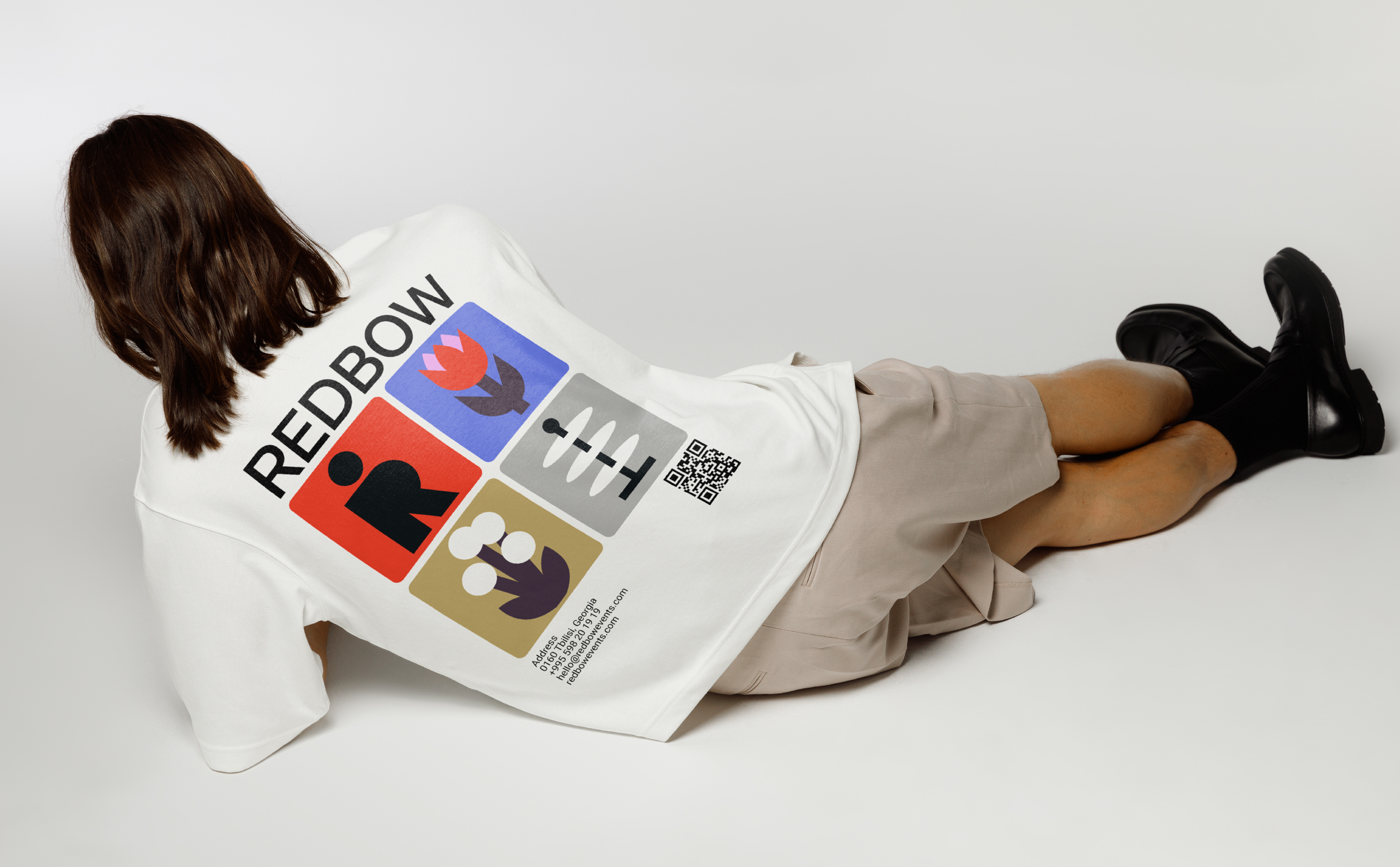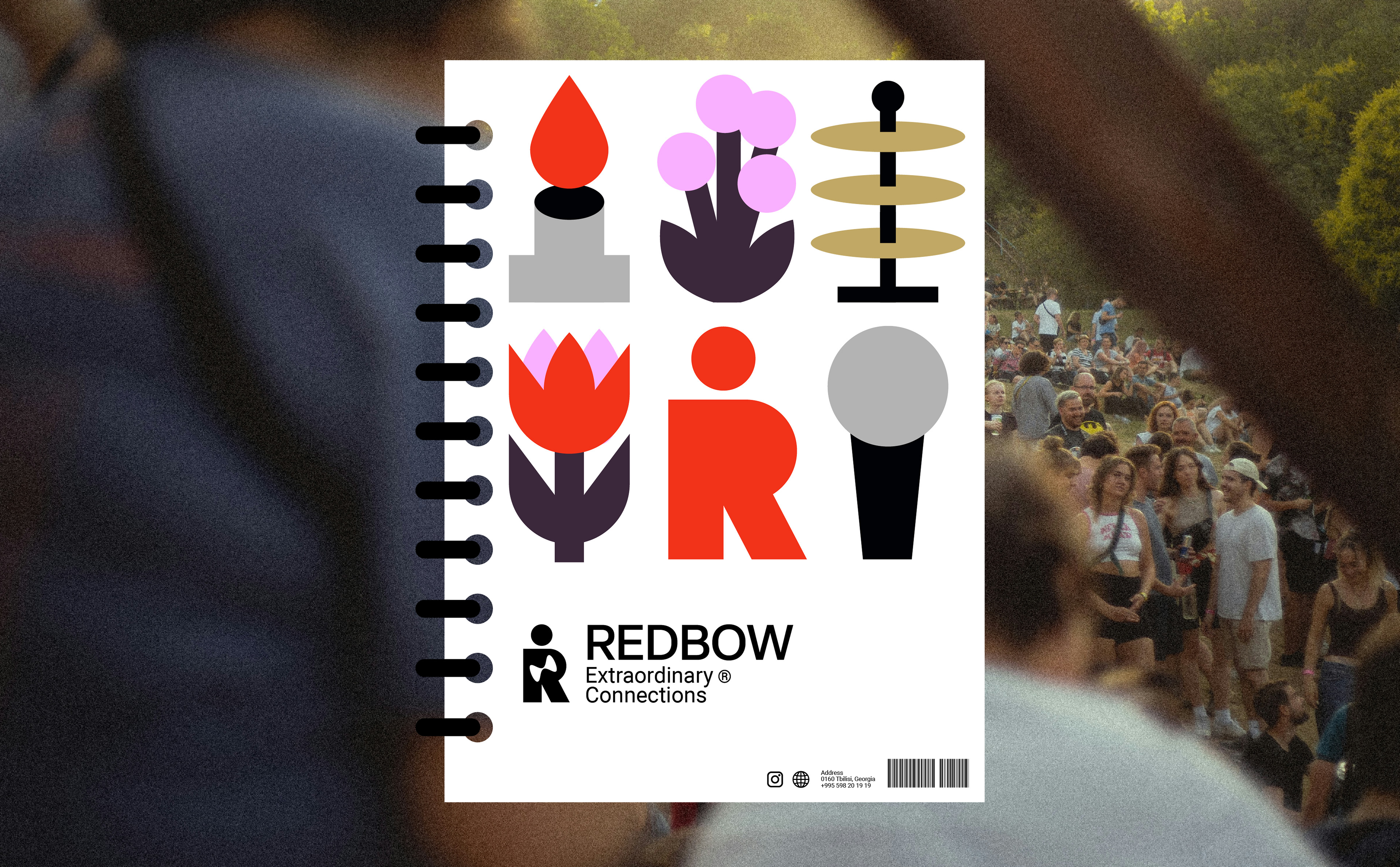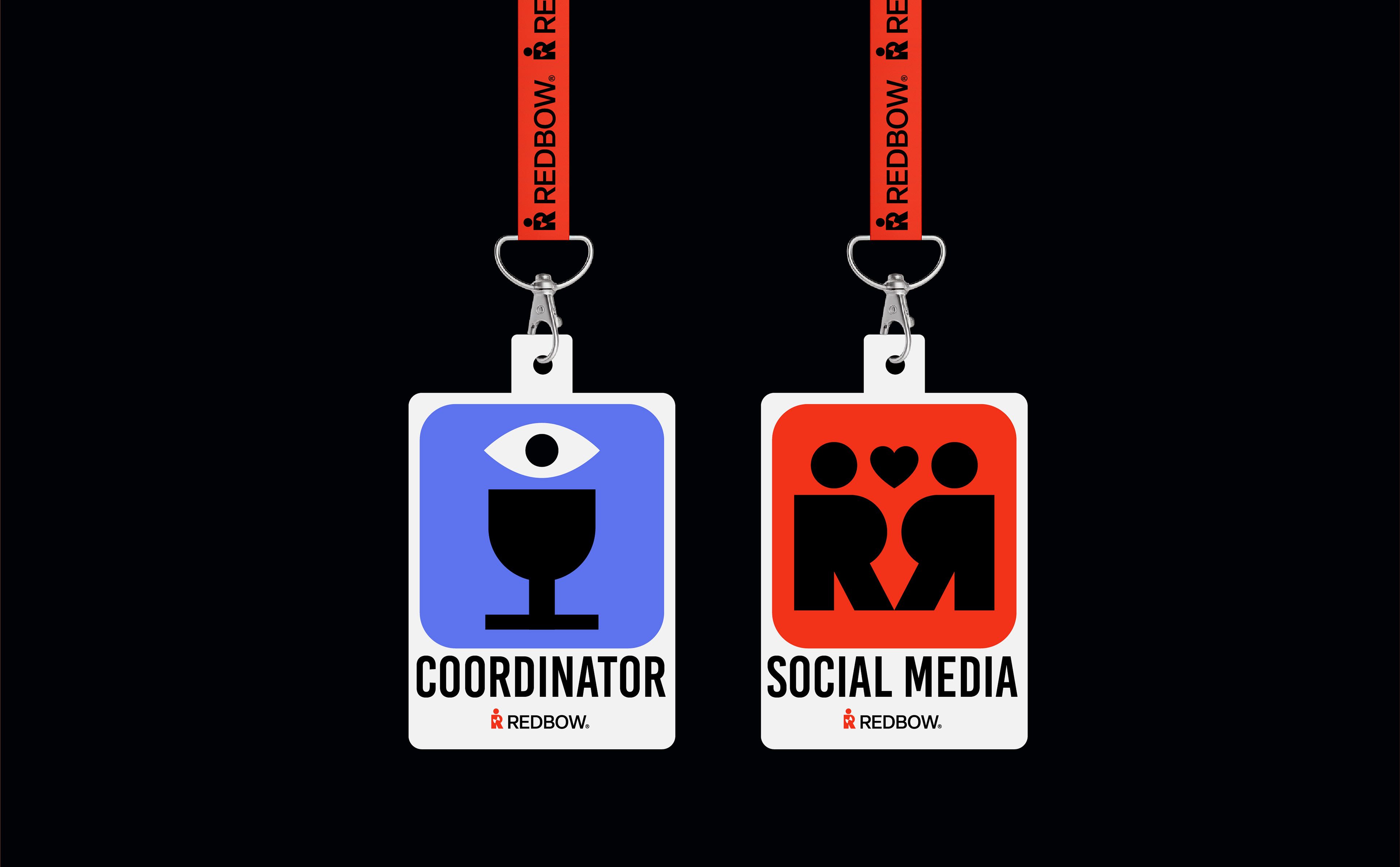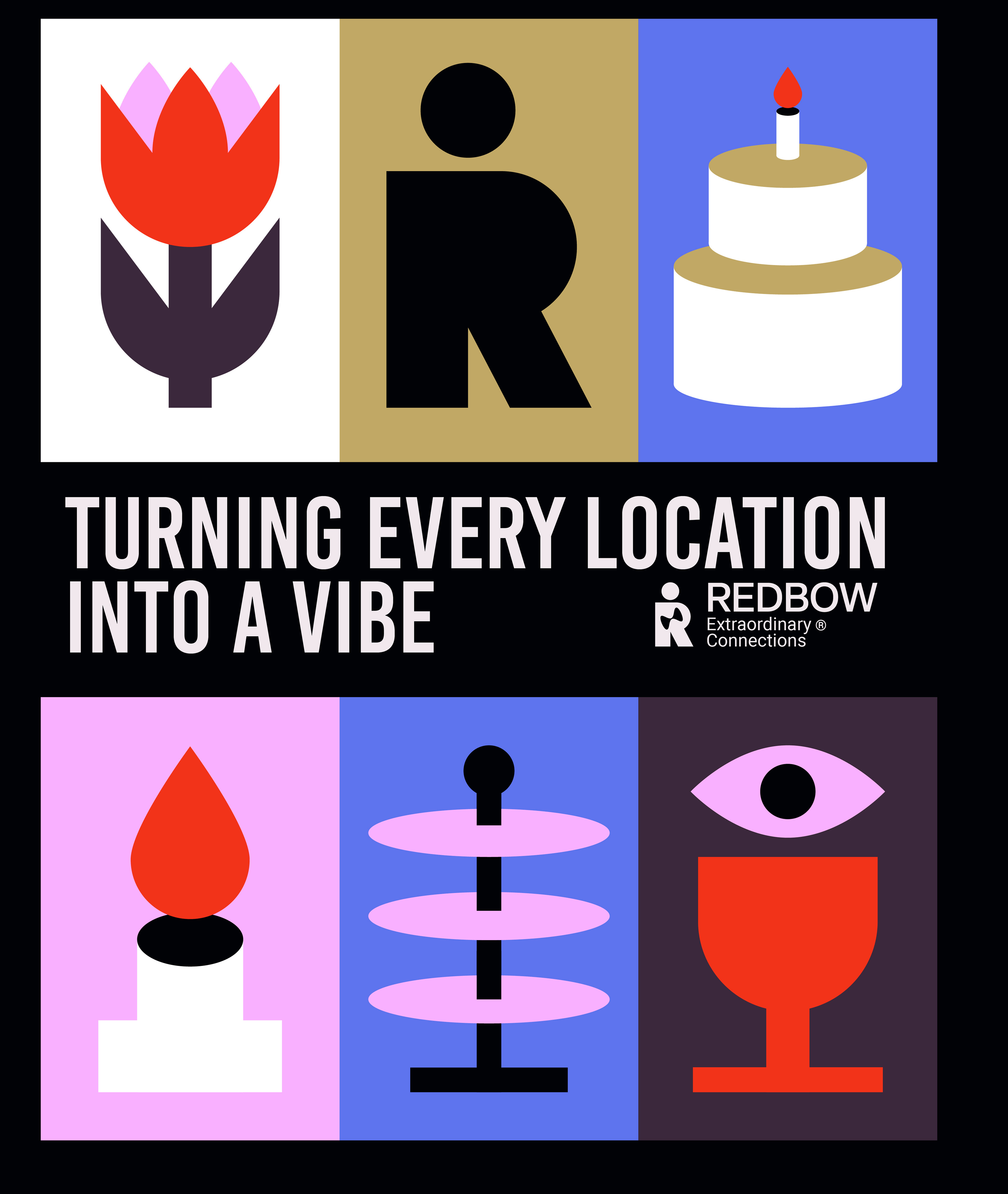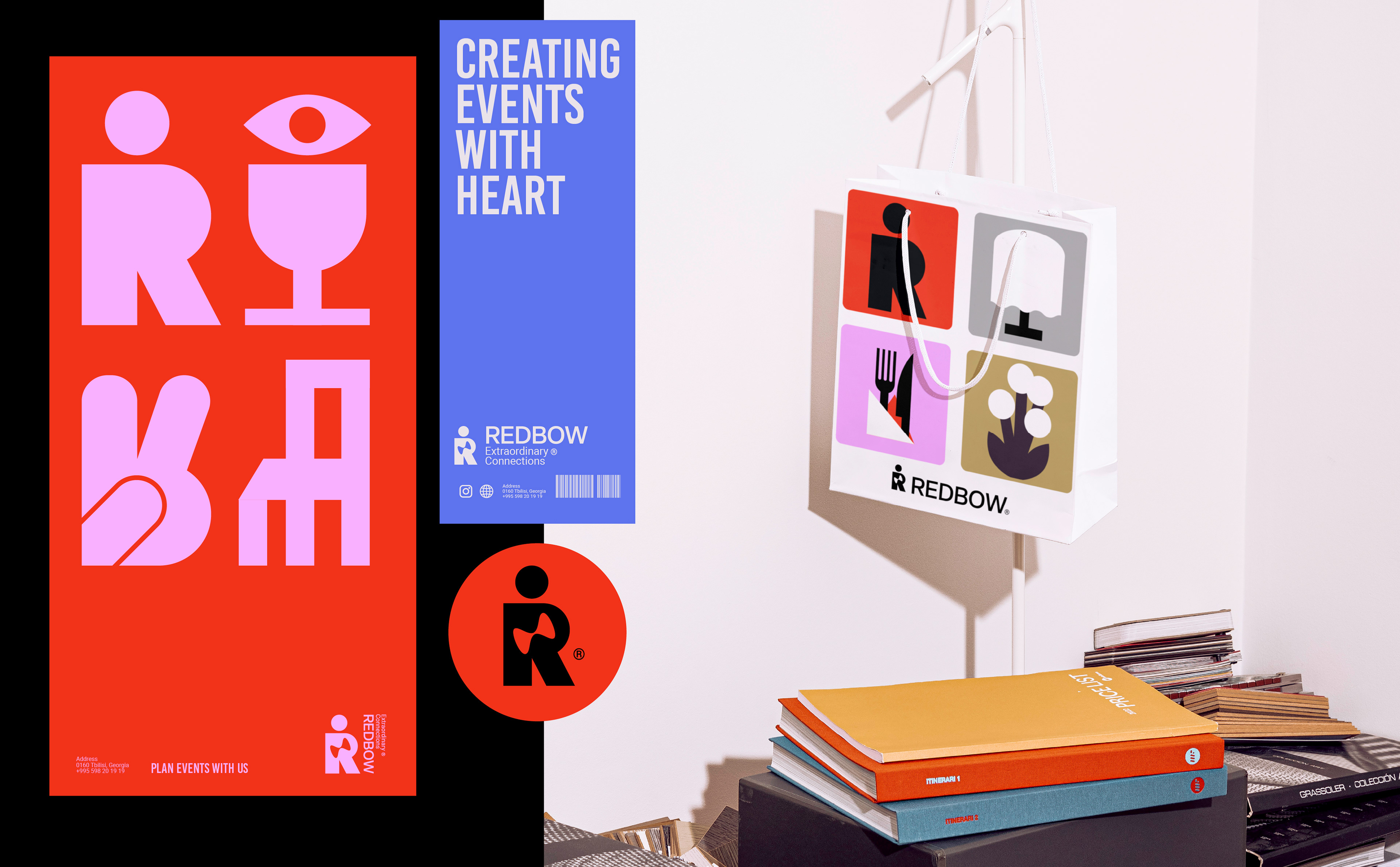
Redbow is an event planning company for which I developed logo and visual identity. The brand’s platform positions Redbow as a transformer of "ordinary moments," with the Magician archetype at its core. This concept inspired the creation of a unique figure-monogram: a human-like magician holding a bow- referencing both the company’s name and its transformative abilities.
The logomark combines the symbolic bow with the letter "R", embodying both the brand’s name and its promise of magical transformation.


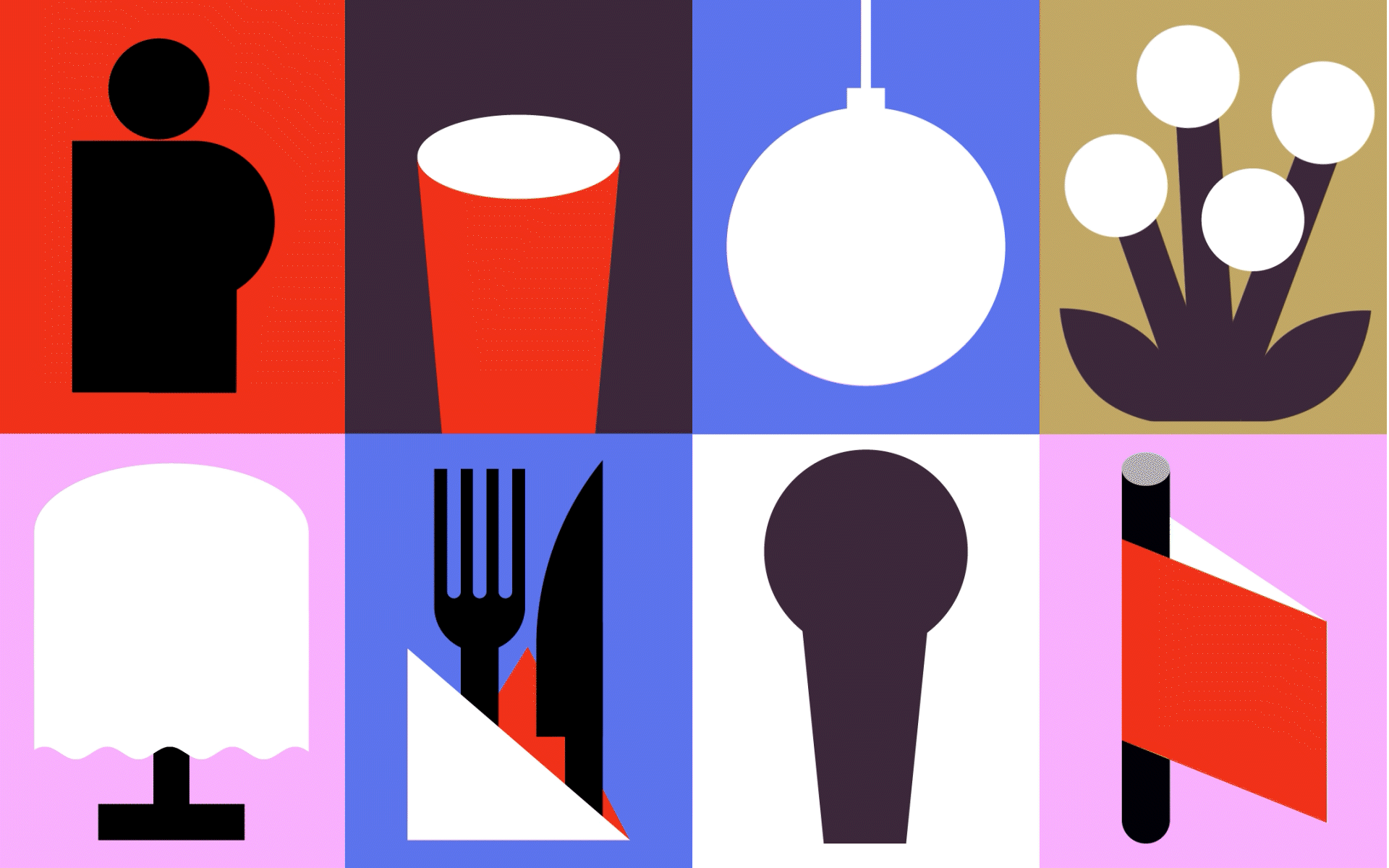
The bow can be swapped with different objects tailored to specific contexts, making the logo dynamic and adaptable.

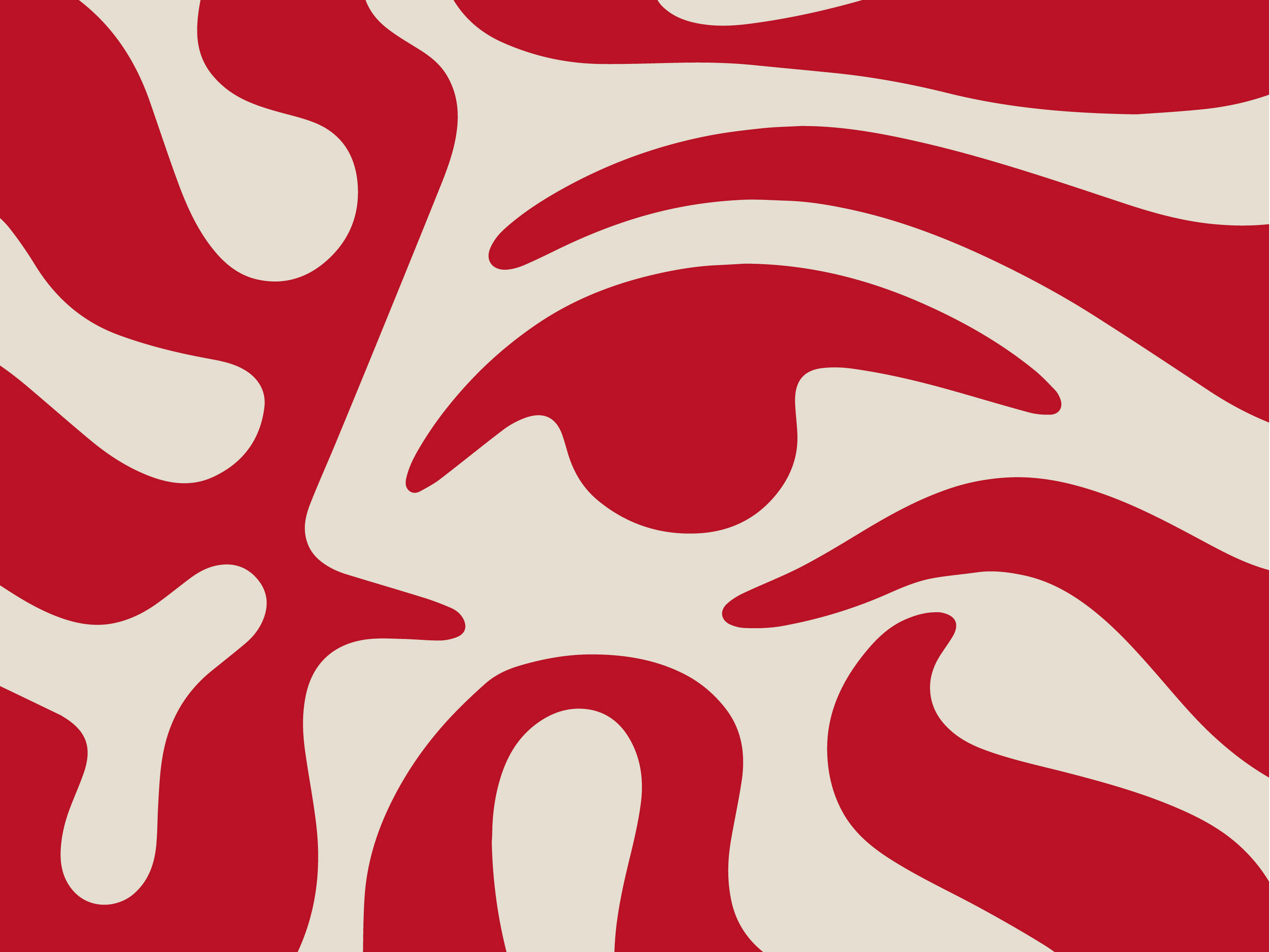
The broader visual system extends from the central figure, which is replicated into patterns that reflect the social and festive spirit of events—people gathering, connecting, and celebrating. Additional icons (like utensils, furniture, and decorations) support and enrich the identity, representing Redbow’s full scope of services in a playful, yet elegant way.