
Due to the unique challenges and distinctive forms of the Georgian alphabet, me with my brilliant graphic designer friend- David embraced the opportunity to redefine its conventional appearance. The availability of display free fonts suitable for both headlines and body text in Georgian is quite limited.
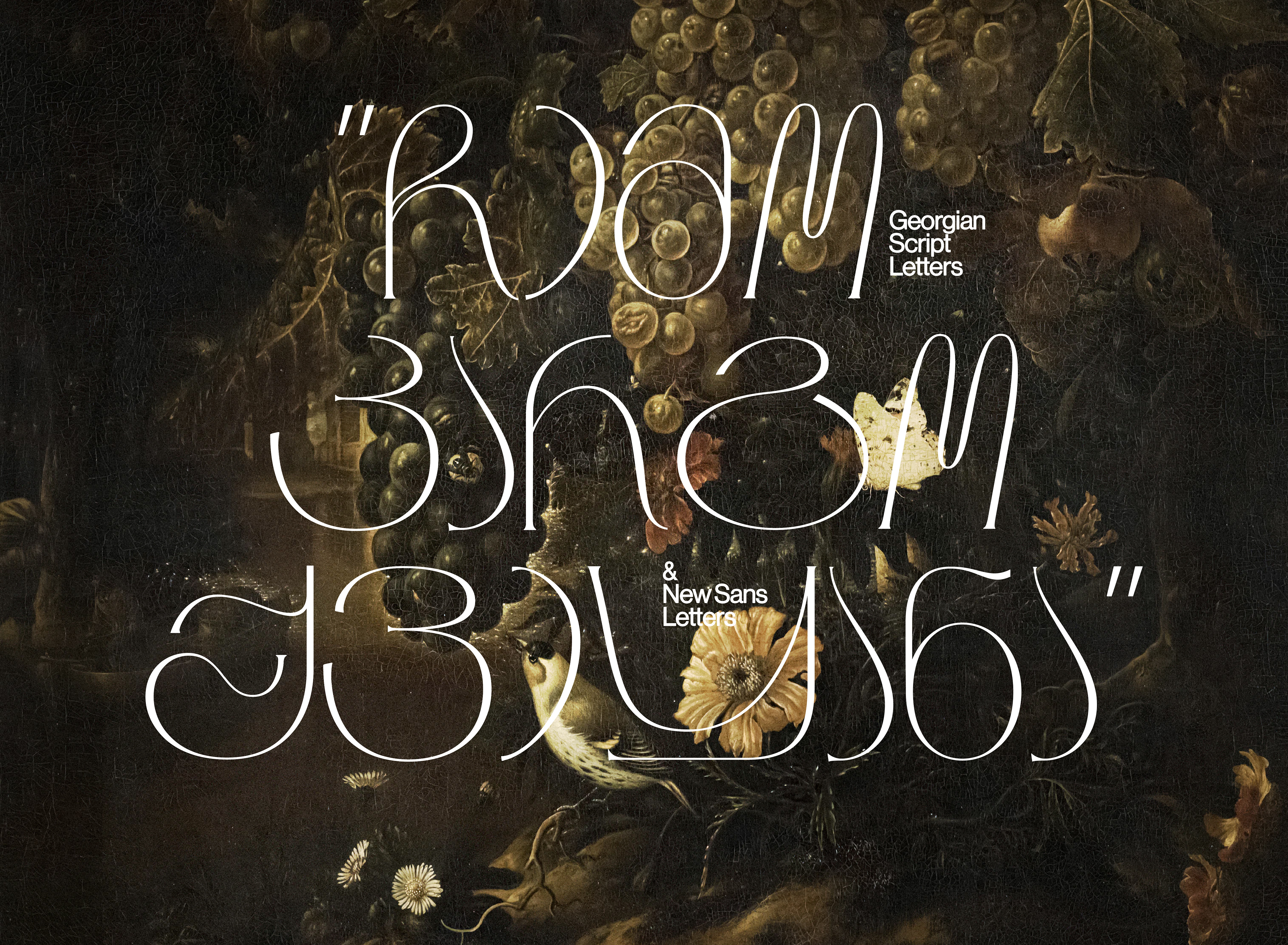
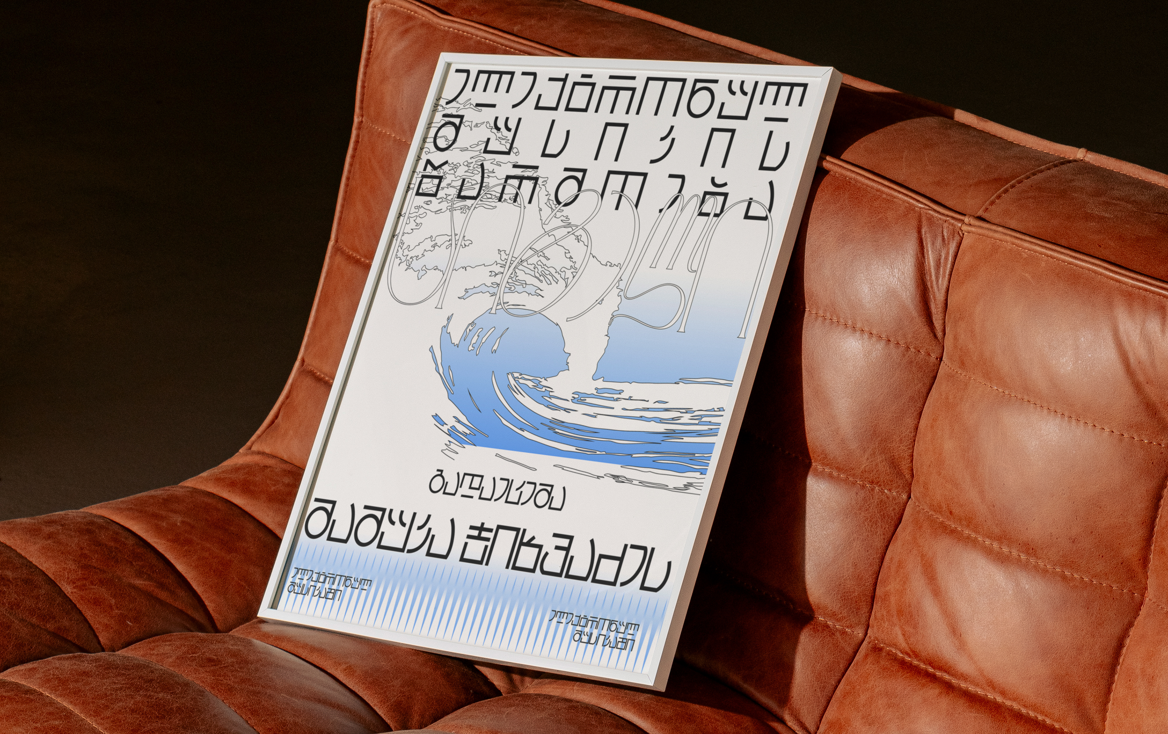
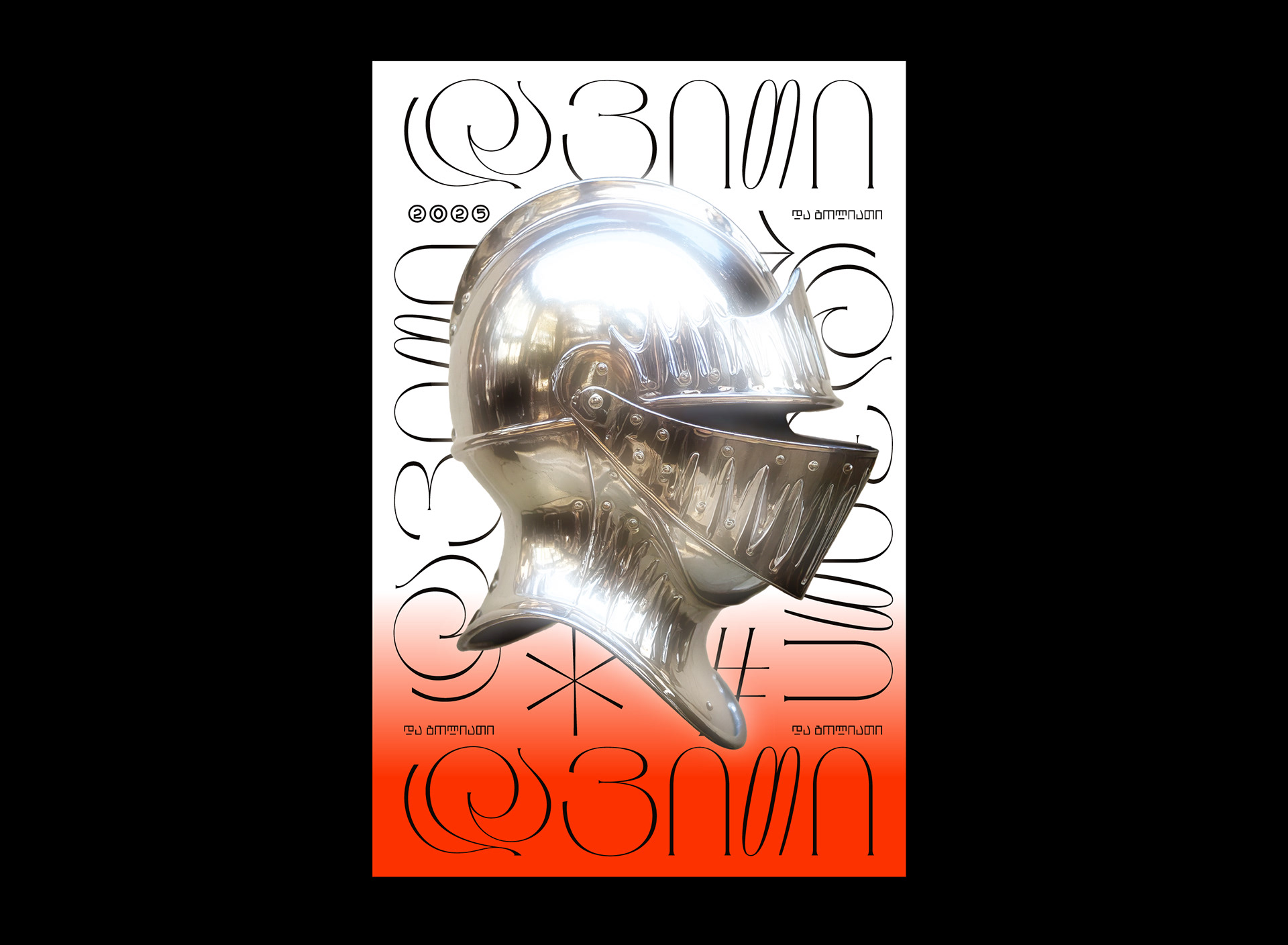
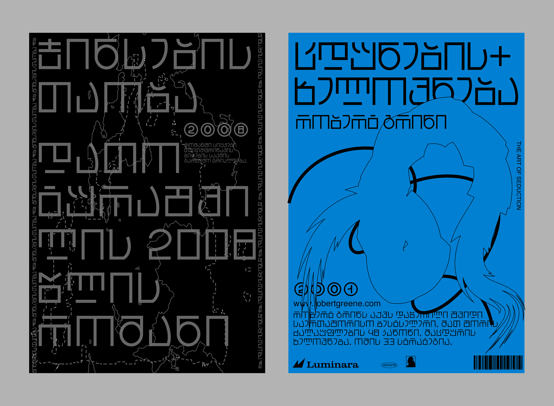
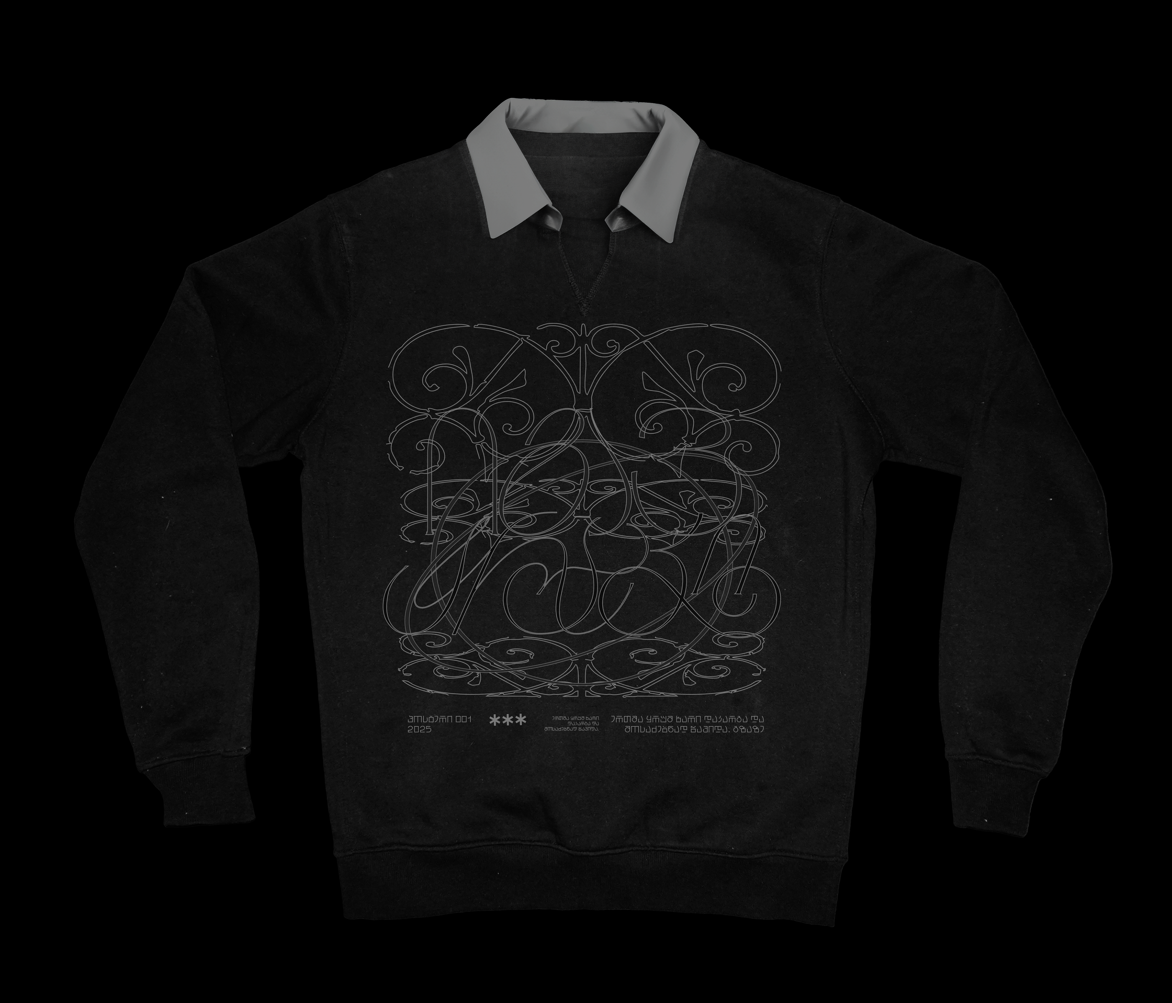
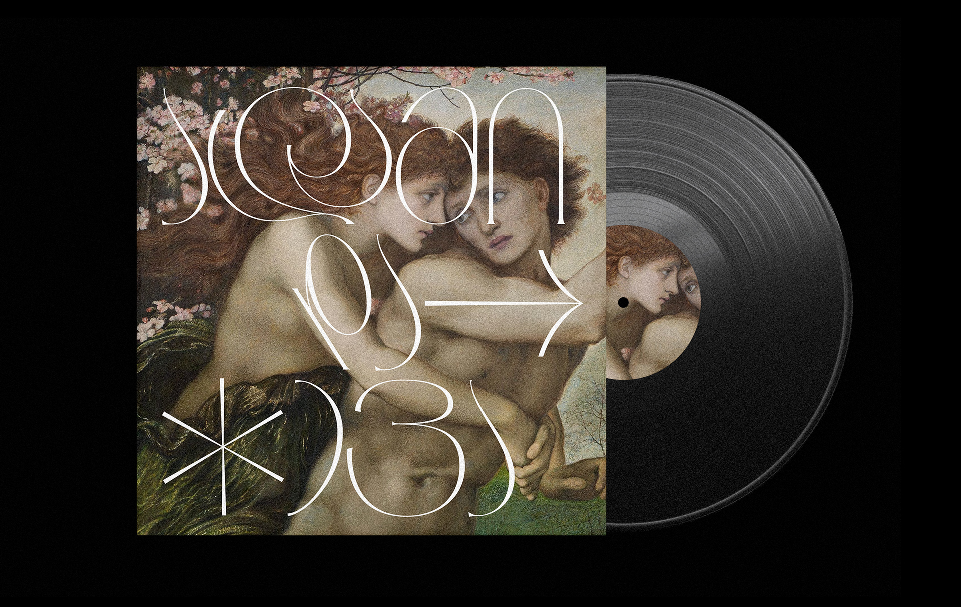
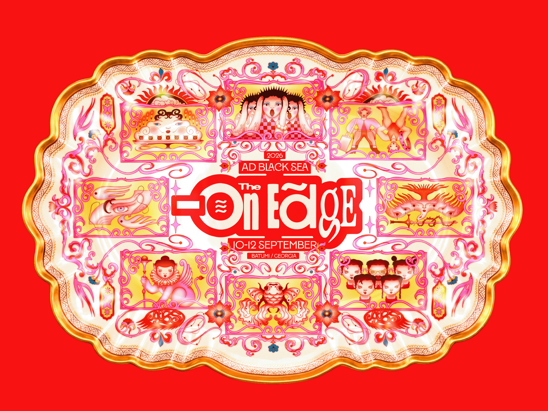
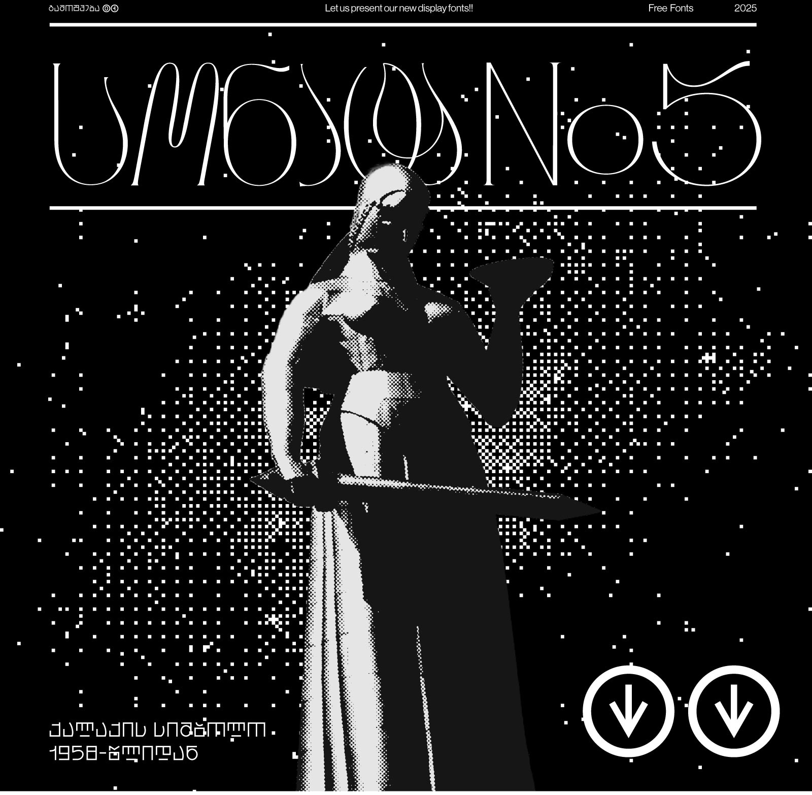
"Neue Impakt" was created to bring a more geometric structure to the Georgian alphabet while preserving its ornamental essence. Inspired by Asian scripts, it maintains both readability and character. "Sonata No5" is like a classical song for the eyes" — highly ornamental, embracing the organic beauty of the Georgian script and emphasizing its full potential. Delicate yet expressive, it captures the intricate elegance of the language.
This presentation showcases how these two fonts complement each other, demonstrating their versatility and the unique ways they can be used together.